Math Portal
Introductory Statistics
Section 1.3 - Frequency Distributions and Histograms
A frequency distribution is a separates data into classes or intervals of equal width and shows how many data values are in each group. The first thing you should do is identify how many classes/groups you want. Typically somewhere between 5 and 10 groups. Next, calculate the class width, class width is the difference between the upper and lower class boundaries divided by the desired number of classes.
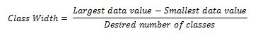
Then increase the value to the next highest whole number, even if the result is a whole number. For example if you calculated a class width and produced a value of 6, we would make the class width 7. Start with the smallest data value and create each interval so that they are all the same width and continue until all data values fall into a single class.
For example:
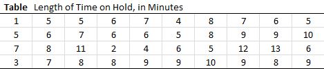
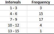
Calculate the class width. Let's go with 5 classes. Largest value is 13 and the smallest is 1. 13-1 = 12 then divide by 5 and we get 2.4. Then increase this number to the next whole number and our class width is 3. Creating our table we should get these intervals. Simply add up the number of data in each class and you have your frequency.
Here are typical attributes of a frequency distribution:
A relative frequency distribution shows the frequency of each class as a proportion or percentage of the whole data set. The total of all relative frequencies should be 1.00 or 100 percent, but instead might be close to 1.00 or 100 percent, due to round-off error. Relative frequencies are useful because percentages make it easier to consider portions of the data compared to the whole. Relative frequency distributions might have two columns, one for the class list and one for the relative frequencies; or they might have three columns: one for the class list, one for the frequencies, and one for the relative frequencies. Here is the relative frequency distribution for the frequency distribution given in the first example:

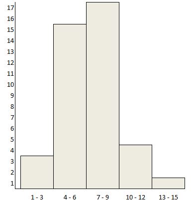
The graphical display of a frequency distribution or a relative frequency distribution is called a histogram. In a histogram, the frequency or relative frequency of occurrence of the data values within a class interval is represented by a rectangular (or vertical) column. The height (or length) of the column is proportional to the frequency or relative frequency of data values within that interval. To read a histogram, examine the frequency or relative frequency scale to determine the number or percent corresponding to the space between tick marks (or grid lines). Then determine where the heights or lengths of the bars fall relative to the scale. Figure 2.1 shows the relative frequency histogram representation for the relative frequency distribution for the data in the first example.
Differences between a Histogram and a Bar Graph
The figures below show an example of a histogram and a bar chart. Histograms are used to show distributions of variables while bar charts are used to compare variables. Histograms plot quantitative, numerical data with ranges of the data grouped into bins or intervals while bar charts plot qualitative, categorical data.
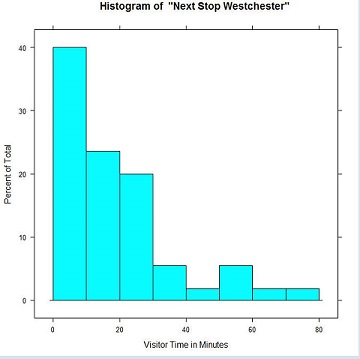
Notice that the horizontal axis of Figure 1 consists of binned times: the first bin includes visits from 0 up to and including ten minutes, the second bin from 10 up to and including 20 minutes, and so on. The vertical axis shows percentages. The area of each bar gives the percentage of all visitors who spent the amount of time shown in the corresponding bin. The sum of all areas equals 100%. Note that it does not make sense to rearrange the bars of a histogram.
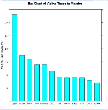
The bar chart of Figure 2 compares the median times visitors stayed at each of 12 exhibitions. The variables on the horizontal axis are categorical; they provide the names of the exhibitions. The vertical axis indicates time in minutes. The height of each bar represents the median time for that exhibition. Bars of a bar chart can be rearranged at will. Many graph designers order the variables alphabetically while ordering by size is usually more informative.
A frequency distribution is a separates data into classes or intervals of equal width and shows how many data values are in each group. The first thing you should do is identify how many classes/groups you want. Typically somewhere between 5 and 10 groups. Next, calculate the class width, class width is the difference between the upper and lower class boundaries divided by the desired number of classes.
Then increase the value to the next highest whole number, even if the result is a whole number. For example if you calculated a class width and produced a value of 6, we would make the class width 7. Start with the smallest data value and create each interval so that they are all the same width and continue until all data values fall into a single class.
For example:
Calculate the class width. Let's go with 5 classes. Largest value is 13 and the smallest is 1. 13-1 = 12 then divide by 5 and we get 2.4. Then increase this number to the next whole number and our class width is 3. Creating our table we should get these intervals. Simply add up the number of data in each class and you have your frequency.
Here are typical attributes of a frequency distribution:
- The data are recorded in a two-column table. The column on the left names the classes and the column on the right is labeled Frequency.
- The class boundaries are listed (in order) in the left column.
- The class width is the same for all classes.
- Each of the original data values must fall into one and only one class.
A relative frequency distribution shows the frequency of each class as a proportion or percentage of the whole data set. The total of all relative frequencies should be 1.00 or 100 percent, but instead might be close to 1.00 or 100 percent, due to round-off error. Relative frequencies are useful because percentages make it easier to consider portions of the data compared to the whole. Relative frequency distributions might have two columns, one for the class list and one for the relative frequencies; or they might have three columns: one for the class list, one for the frequencies, and one for the relative frequencies. Here is the relative frequency distribution for the frequency distribution given in the first example:
The graphical display of a frequency distribution or a relative frequency distribution is called a histogram. In a histogram, the frequency or relative frequency of occurrence of the data values within a class interval is represented by a rectangular (or vertical) column. The height (or length) of the column is proportional to the frequency or relative frequency of data values within that interval. To read a histogram, examine the frequency or relative frequency scale to determine the number or percent corresponding to the space between tick marks (or grid lines). Then determine where the heights or lengths of the bars fall relative to the scale. Figure 2.1 shows the relative frequency histogram representation for the relative frequency distribution for the data in the first example.
Differences between a Histogram and a Bar Graph
The figures below show an example of a histogram and a bar chart. Histograms are used to show distributions of variables while bar charts are used to compare variables. Histograms plot quantitative, numerical data with ranges of the data grouped into bins or intervals while bar charts plot qualitative, categorical data.
Notice that the horizontal axis of Figure 1 consists of binned times: the first bin includes visits from 0 up to and including ten minutes, the second bin from 10 up to and including 20 minutes, and so on. The vertical axis shows percentages. The area of each bar gives the percentage of all visitors who spent the amount of time shown in the corresponding bin. The sum of all areas equals 100%. Note that it does not make sense to rearrange the bars of a histogram.
The bar chart of Figure 2 compares the median times visitors stayed at each of 12 exhibitions. The variables on the horizontal axis are categorical; they provide the names of the exhibitions. The vertical axis indicates time in minutes. The height of each bar represents the median time for that exhibition. Bars of a bar chart can be rearranged at will. Many graph designers order the variables alphabetically while ordering by size is usually more informative.